.png)
This section contains the visual elements that are foundational to the LiveRamp brand identity—Color Palette, Typography, and Grid. These elements work to support a larger branded system that is unmistakably LiveRamp.

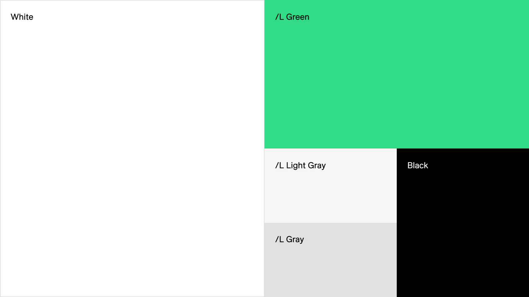
/L Green is the cornerstone of our brand colors. It should be ever-present in designs but never overused. /L Green is supported by /L Blue and a range of neutrals. Always use colors strategically and with restraint to maximize their impact. White space is key in our visual system—designs should always look open and airy, never dense and heavy.
Shades of /L Green make up our secondary palette. Use these colors only as solid backgrounds in B2B client photos (see Our Photography) or for data visualization. Do not use them for any other application.
Our tertiary palette is comprised of the functional colors yellow, orange and red. They are used exclusively in product.

HEX: #FFFFFF
RGB: 255 / 255 / 255
CMYK: 0 / 0 / 0 / 0
Pantone: —
HEX: #32DB86
RGB: 50 / 219 / 134
CMYK: 78/ 0 / 80 / 0
Pantone: 7480 C
HEX: #E1E1DF
RGB: 225 / 225 / 223
CMYK: 14 / 10 / 8 / 0
Pantone: Cool Gray 2 C
HEX: #000000
RGB: 0 / 0 / 0
CMYK: 0 / 0 / 0 / 100
Pantone: —
HEX: #F7F5F5
RGB: 247 / 245 / 245
For digital use only

For in-product use only
HEX: #FDD703
RGB: 253 / 215 / 3
HEX: #FF6224
RGB: 255 / 98 / 36
HEX: #F21D44
RGB: 242 / 29 / 68
Typography is an essential component of the LiveRamp Brand Identity and adds to our unique personality. It helps unify our communications and tell our story.
The LiveRamp typographic system is built around ES Allianz which aims to impart a modernist spirit to contemporary works. An organic, yet concrete and subtly hand-drawn design, the typeface is both dense and readable, objective and lively.


Our custom version of ES Allianz uses a single-story lowercase “a” to echo the typography of our logo. If you are using the regular, commercially available version of ES Allianz, make sure to specify the single-story “a” in OpenType settings. It’s a small detail, but it’s an important one.

Mulish is our alternate font for situations whenES Allianz isn’t available. Use it only for internal and external non-marketingdocuments in applications such as MicrosoftOffice and Google Workspace.
In situations where Mulish is not available,Arial
may be used. However, due to its limited number
of weights, it should only be used as a last resort.
Mulish is available as a free download from
fonts.google.com. Arial is a system font in both Windows and MacOS.
ABCDEFGHIJKLMNOP abcdefghijklmnopqrstu 1234567890!@#$%&?*
ABCDEFGHIJKLMNOP abcdefghijklmnopqrstu 1234567890!@#$%&?*
ABCDEFGHIJKLMNOP abcdefghijklmnopqrstu 1234567890!@#$%&?*
ABCDEFGHIJKLMNOP abcdefghijklmnopqrstu 1234567890!@#$%&?*
To keep our typography looking clean, elegant, and easy to read, we use scale—more so than weight—to establish clear heirarchy among different levels of information.
As a general rule throughout our visual system, type gets lighter in weight as it gets larger. Use Allianz Regular for large headlines, and Allianz Light for large intro text. For larger paragraph headers, use Allianz Medium for contrast. For smaller type like body text and captions, use Allianz Regular.
Allianz Bold should be reserved exclusively for paragraph headers at small sizes, and emphasis within passages of text. It should never be used at large scale. Italics should only be used to denote titles and names of works.
Use generous line spacing (1.2–1.5x) for optimum readability. Letter spacing should not be adjusted in most cases, but you can make very small (+/– 3%) adjustments to tighten very large text or open up very small text.
Allianz Light Large Intro Text non rat pra nonsequatur, optur, omnist, omnimolest,am re optam eossi tetur, sintest rumquis tectus, ilitaero maiori quametur uda numqui.
Allianz Medium Paragraph Header
Allianz Light Large Intro Text lorem ipsum dolor imolest amre optam eossi tetur.
Allianz Bold Paragraph Header
Allianz Regular Body Text optur oimolest, ipsum
Allianz Bold is used for emphasis
Regular Italics is Used to Denote Names of Works
Allianz Regular Caption with +3% letter spacing
When placing type on colored backgrounds, remember that legibility is key. Shown here are type/background combinations that do and don’t work.

The LiveRamp grid is the foundation upon which the brand identity system is built. It must be used across all branded applications—both digital and print.
The first step in building out the grid involves determining the closest ‘perfect squares’ that correspond with the dimensions of the application.1 In this example, we are using 1920x1080px. The perfect squares indicate the number of actual squares in the grid on each axis, and make up our ‘base layer’.
In this instance the closest perfect squares to 1920px are 1849px and 1936px. Therefore, the number of squares are 43px and 44px respectively. The closest perfect squares to 1080px are 1024px and 1089px, which is 32px and 33px squares respectively.
You can double or half the number of squares in the base layer by multiplying or dividing by 2.2 This will ultimately allow for the flexibility to create more layout options.
You will notice that the squares might not completely fill the page. In this case, we lengthen the squares to account for the extra space. 3
With the base layer now in place, use it as a guide for incorporating features into the grid—visible grid lines (columns/rows) and the LiveRamp slash.4 These features not only add visual interest to layouts, but act as an organizational device for separating text blocks and graphic elements.
It is important to note that the slash should always be in the same direction as the slash in our logo.
Note: the steps mentioned above would can be applied to applications requiring margins. The grid can be built within the live area of the application as shown in the grid samples below.


Using the extracted ‘L’ shape from our monogram logo, we can employ the use of the shape in brand colors as a super graphic in layouts. The natural structure of the letterform is a direct reflection of the support that LiveRamp provides clients and partners, placing them in the hero of the frame.
The super graphic acts as a framing device, and can flex to the needs of the layout and content as seen in the examples, providing clear hierarchy while maintaining brand recognition.


