Color

Color is a foundational part of the LiveRamp visual system. It's a powerful tool that helps us connect with our audience on a nonverbal, emotional level.
Primary Palette
LiveRamp’s color system is bold and high-contrast. Our Primary Green imbues the brand with a sense of energy, growth, and momentum, with black and white providing the core foundation.
Our three primary colors are Green 00 (our Primary Green) White, and Black. Green 00 should appear in every design. Black should only be used for utility, not for decoration.

Secondary Palettes
For some applications, you might need a broader palette. We use these colors for times when the three primary colors don’t offer enough flexibility or nuance. Lighter or darker shades of green and grey should never substitute Green 00 or Black as primary colors.
Note: Refer to the type colors in each swatch for the correct contrasting color for type, etc.
Greens

Greys
Note: Cool Greys should only be used for UI elements, divider lines, etc. For color floods, default to the Warm Grey palette.

Don't do this


Don’t create additional color stops outside of the provided palettes

Don’t introduce new hues
Tertiary Palette
When the secondary palettes have been exhausted, we have a tertiary palette of blues that allow for differentiation and contrast, e.g. in data visualizations.
None of these colors should replace primary brand colors. They should only be used in the specific instances in which a contrast in hue is necessary from accessibility standards. If in doubt, contact the brand team at Brand@LiveRamp.com.
Note: Refer to the type colors in each swatch for the correct contrasting color for type, etc.
Blues

Do this

Do exhaust the entirety of the secondary green shades before leveraging blue

Do retain visual contrast between colors when differentiating data sets
Don't do this

Don’t use tertiary colors as a primary or accents
Color Hierarchy
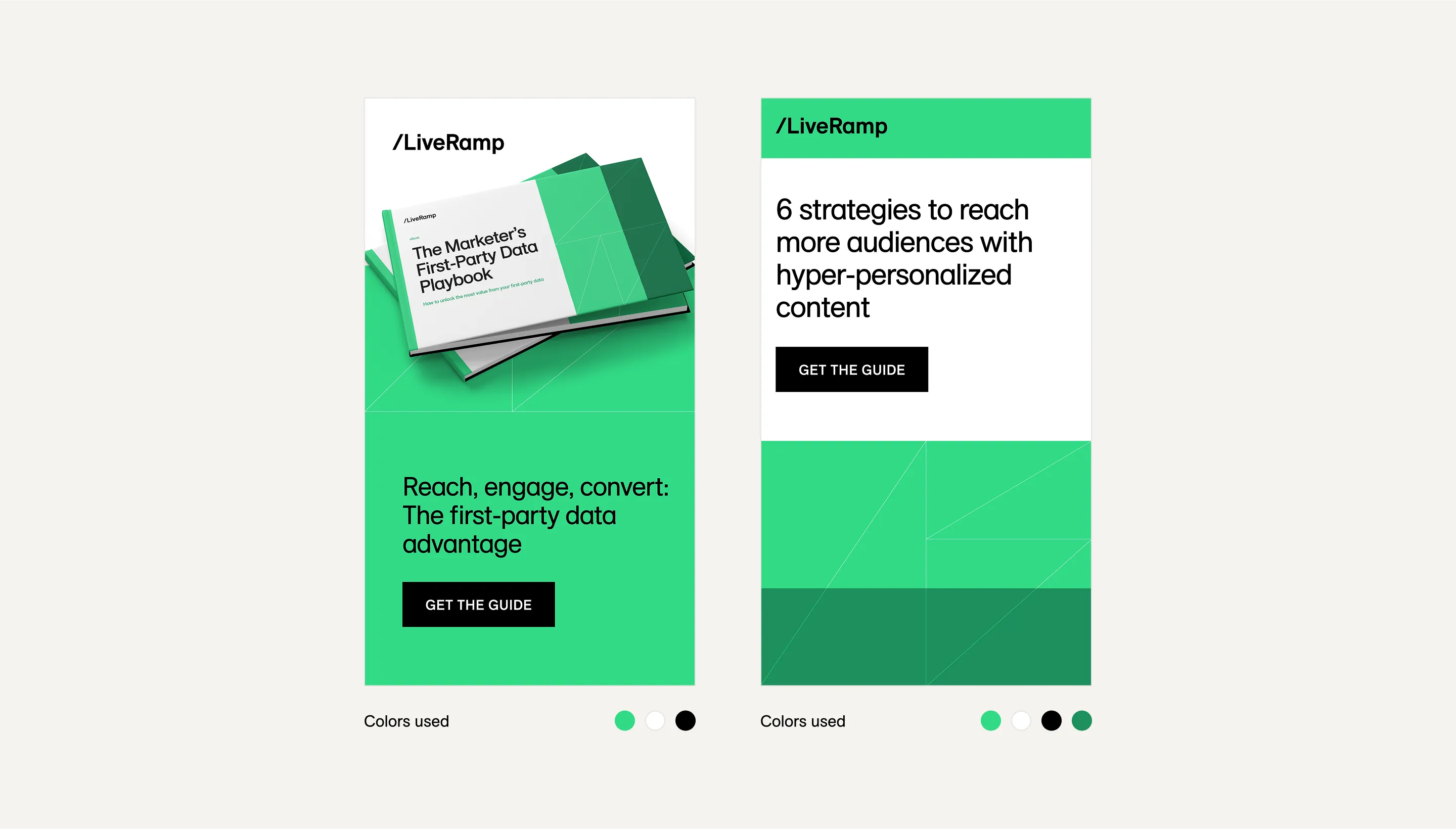
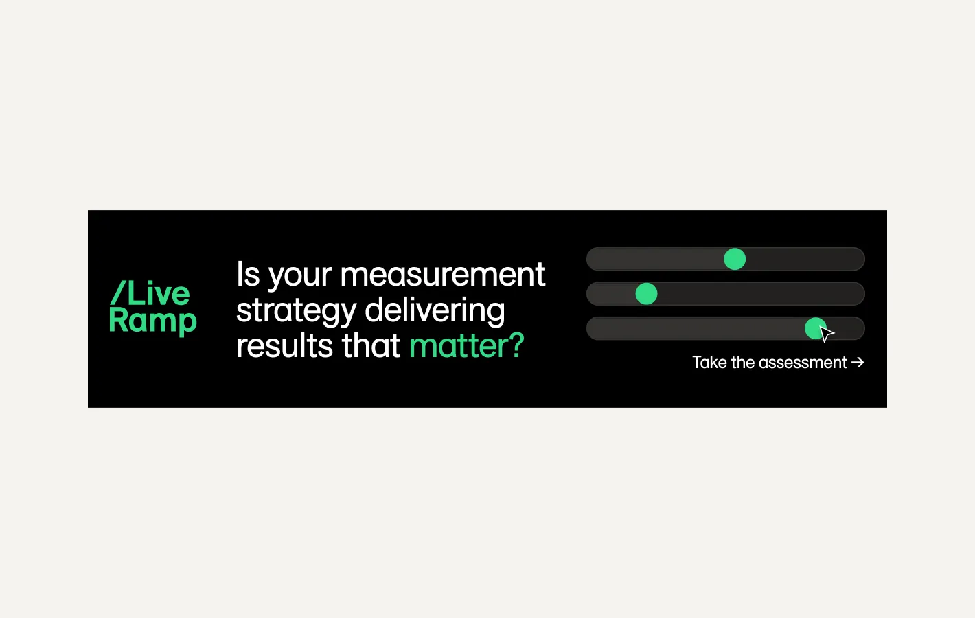
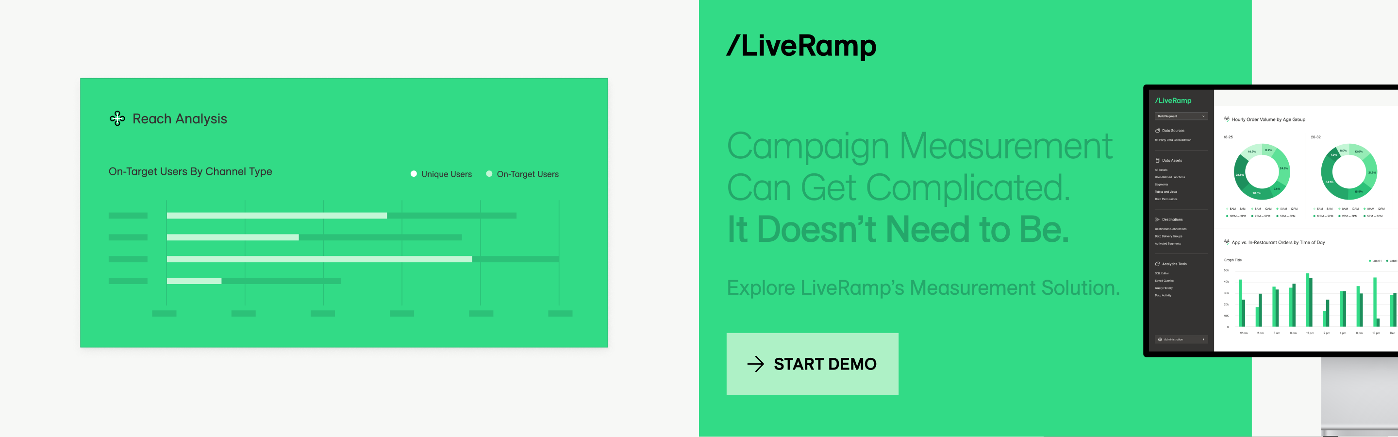
We prioritize Primary Green and White in our designs, and keep other colors in proportion. Primary Green and White must be the two most dominant colors in a design. Do not use black as a dominant color.
Layouts should have a minimum of two colors and a maximum of four colors – please see example ratios below.


Do this
Do leverage color blocking according to color hierarchy to add visual interest
Always include Primary Green in your design
Incorrect Color Usage
Please take note of the incorrect usage illustrated below. The LiveRamp visual style is crisp and elegant, and color combinations that break with defined color hierarchies or provide insufficient contrast dilute the visual impact.
Don't do this

Don’t use a shade darker than Green 00 as a dominant color
Don’t use black as a primary color application
Don't do this
Do not use green on green color when designing with type, graphics, and product illustrations.
Color Accessibility
To ensure all text is accessible to the reader, we need to be mindful of certain color combinations for both light and dark backgrounds. LiveRamp requires a text contrast of 4.5:1 as per the WCAG 2.0 level AA standard.
Do this

Contrast ratio: 21:1 – PASS

Contrast ratio: 11.61:1 – PASS

Contrast ratio: 11.61:1 – PASS

Contrast ratio: 11.61:1 – PASS
Don't do this

Contrast ratio: 1.8:1 – FAIL

Contrast ratio: 3.48:1 – FAIL

Contrast ratio: 2.26:1 – FAIL

Contrast ratio: 1.8:1 – FAIL
Color Vision Variations
Considering accessibility needs is a paramount part of the LiveRamp design system, color included. Below are swatch guides to consider when designing for color vision deficiency. The below are conversions for Color Vision Deficiency.
No Changes

Tritanomaly

Deuteranopia

Deuteranomaly

Protanopia

Protanomaly

Tritanopia

Achromatomaly

Achromatopsia
