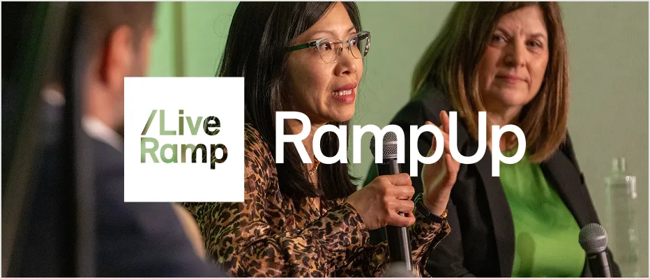
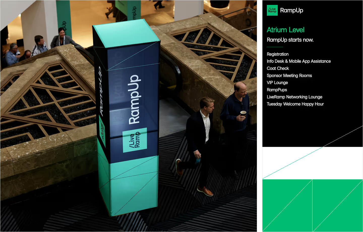
RampUp
RampUp is our annual customer conference, and its branding takes cues from the broader LiveRamp brand, with some alterations to differentiate.
Beyond the differences listed below, all core LiveRamp brand guidelines apply, including usage of the LiveRamp logo, grids, and iconography.
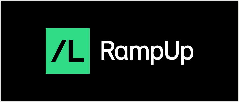
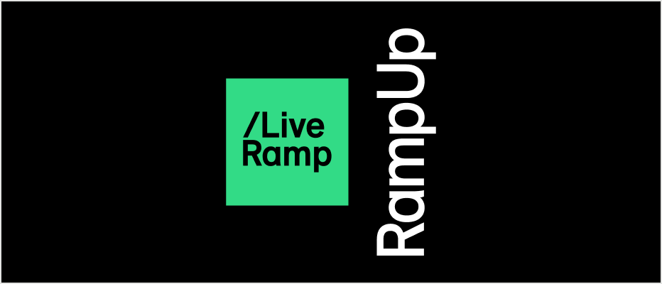
Logo
The RampUp logo is a compilation of the LiveRamp vertical logo and the RampUp wordmark.
Clear Space
Clear space is the area surrounding the entire logo. It must be kept free of any visual elements, including text, graphics, borders, patterns, and other logos.
Clear space is measured in relation to “X,”which equals half of the width of the square bounding box in the logo.
Color Variations


DEFAULT – Green logo/black background

Green logo/white background

Black logo/green background

White logo/black background
There are four color variations on the RampUp logo: positive/green, positive/black, negative/green, and negative/white.
Note that the “LiveRamp” logo is filled in each variation, not knocked out.
Don't do this

Change the logo colors beyond the provided variations
Knock out the LiveRamp logo
Otherwise alter the LiveRamp logo

Rearrange the elements of the logo
Remove the LiveRamp logo
Rotate elements of the logo
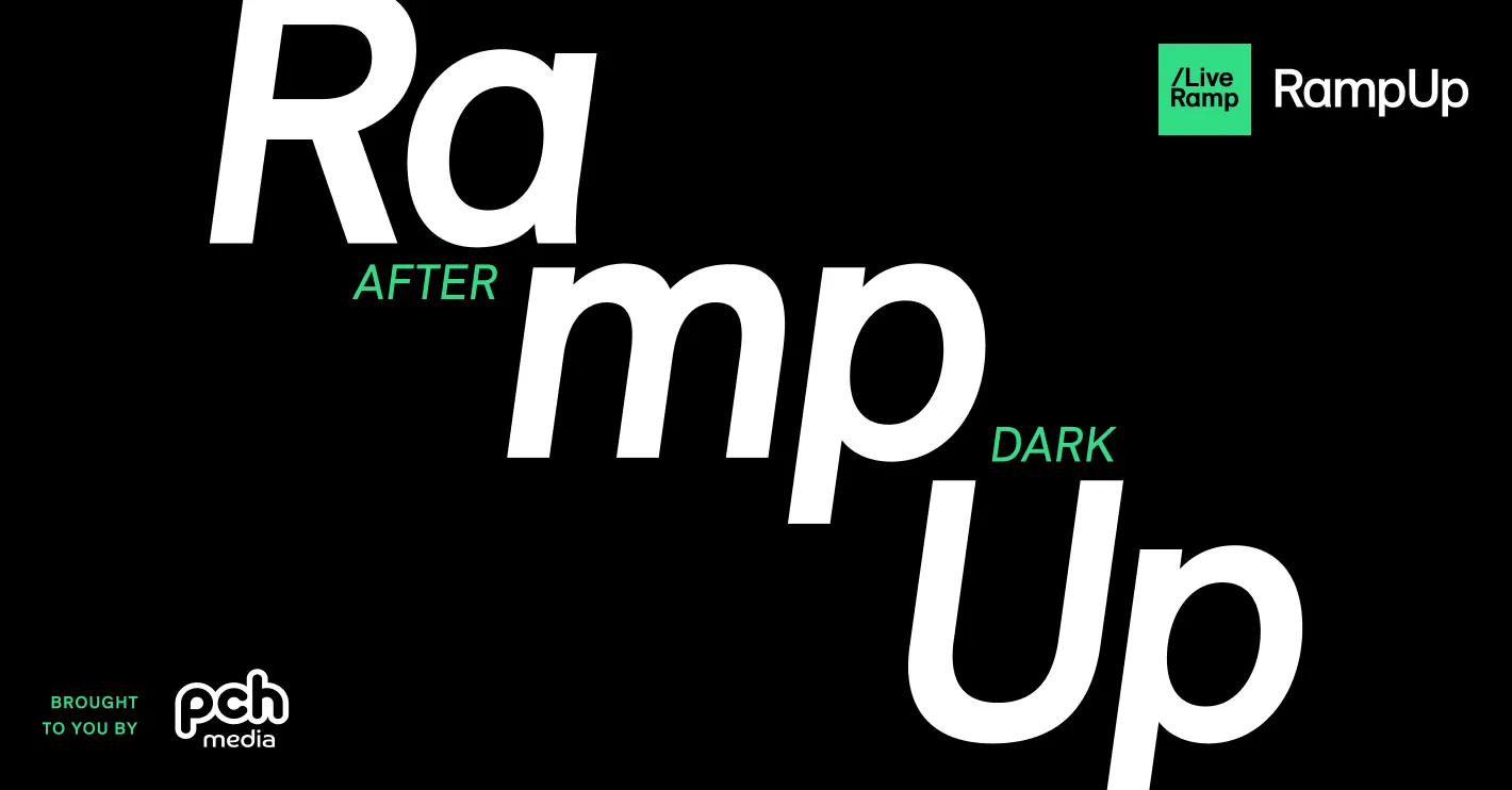
Color
The RampUp color palette is essentially the same as our LiveRamp palette, but with the color hierarchy inverted. Additional colors from the LiveRamp palette should only be used for instances where an expanded palette is required, ie data visualization.

Color best practice—lead with black

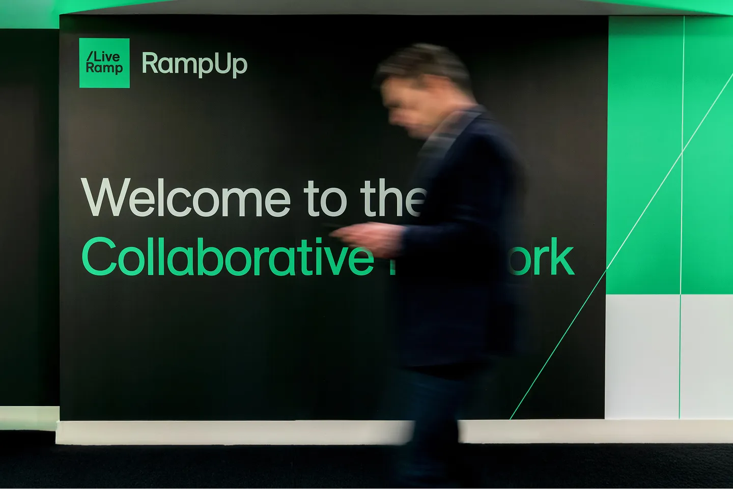
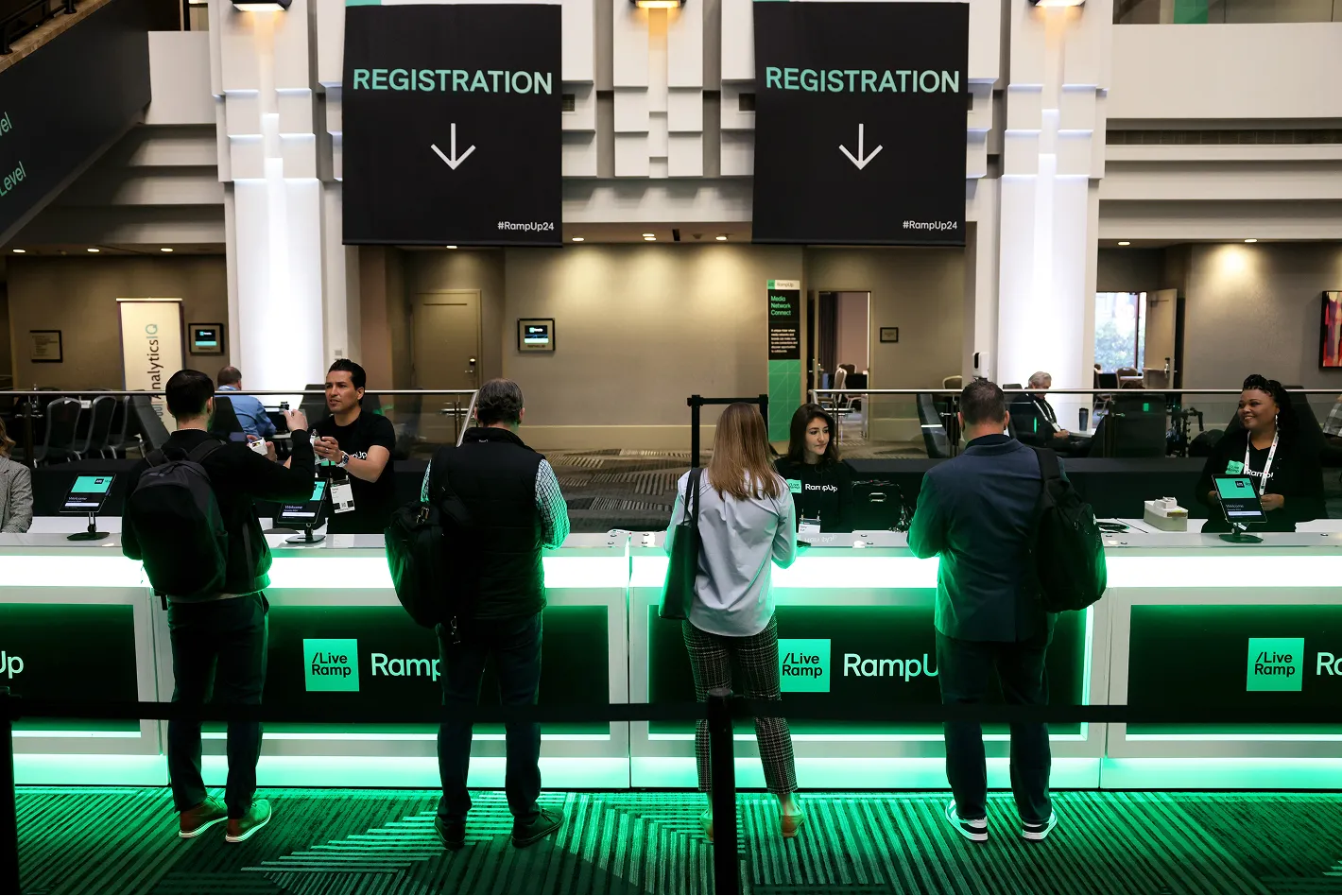
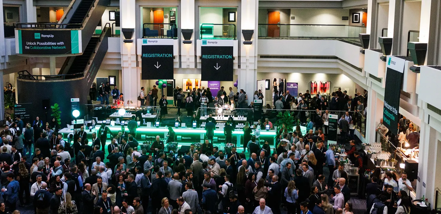
LiveRamp Assets at RampUp
There are experiences on-site at RampUp where we lead with the LiveRamp brand—specifically at product showcases and anywhere with a sales presence. In those moments, defer to the LiveRamp brand guidelines and color hierarchy.


The above signage is located in the LiveRamp Showcase, which is a space for product demos and sales conversations—and LiveRamp branding.