Typography

Typography is an essential component of the LiveRamp visual language and adds to our unique personality. It helps unify our communications and tell our story.
The typographic system is built around LiveRamp Sans. An organic, yet concrete and subtly hand-drawn design, the typeface is both dense and readable, objective and lively.
Weight
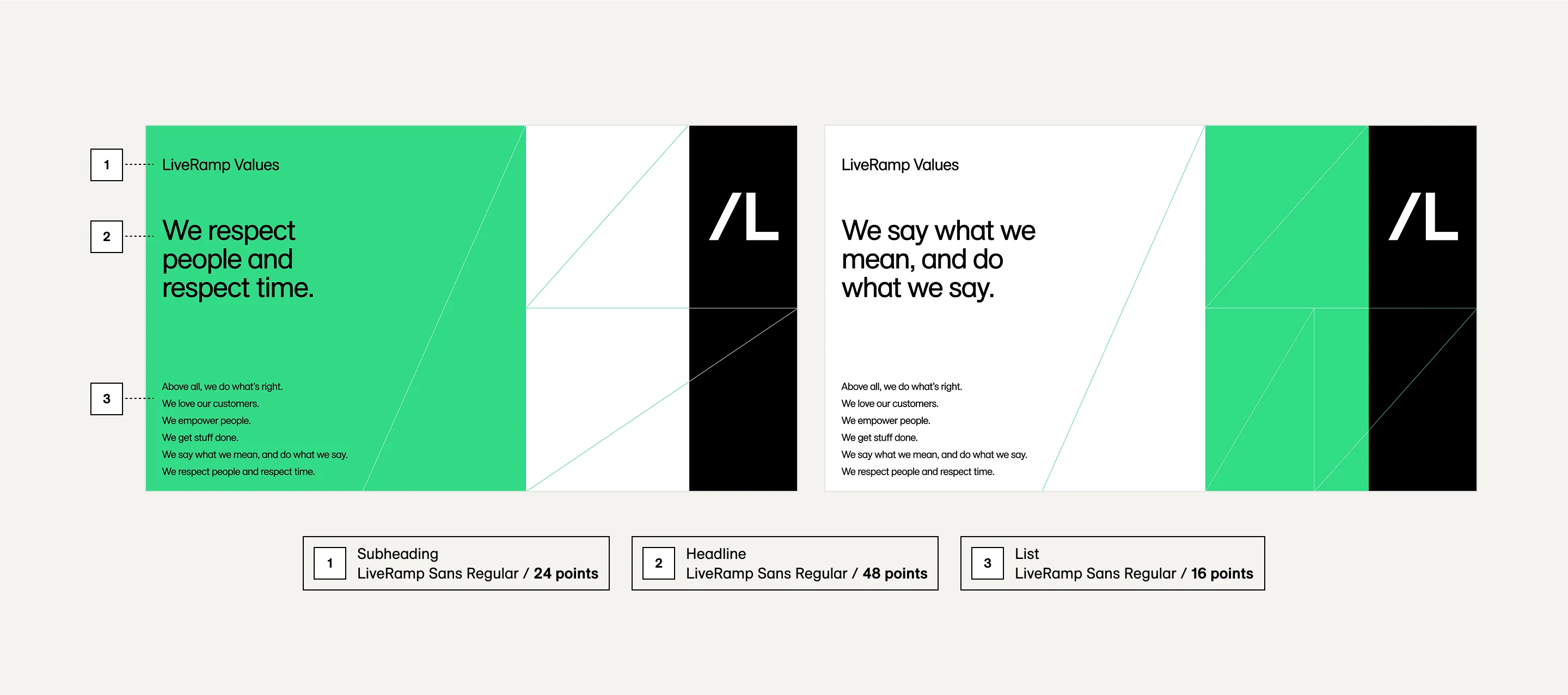
As a general rule throughout our visual system, type gets lighter in weight as it gets larger. Use LiveRamp Sans Regular or Light for large headlines and intro text. For paragraph headers, use LiveRamp Sans Medium for contrast. For smaller type like body text and captions, use LiveRamp Sans Regular.
LiveRamp Sans Bold should be reserved exclusively for paragraph headers or captions at small sizes, and emphasis within passages of text. It should never be used at large scale. Italics should only be used to denote titles and names of works.

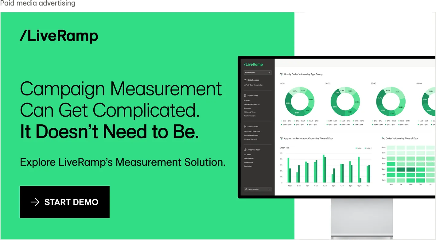
Headlines are set in LiveRamp Sans Regular and LiveRamp Sans Light. Title words pulled out for emphasis are set in LiveRamp Sans Book.
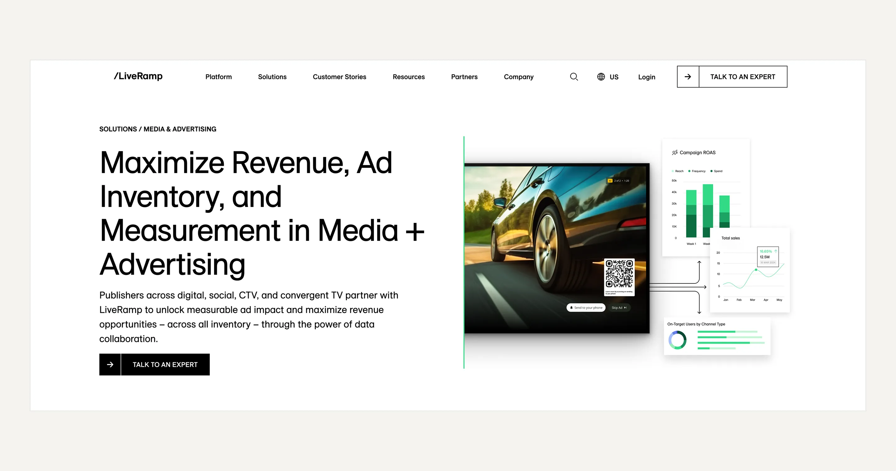
The headline H1 is set in LiveRamp Sans Regular
Scale
If in doubt, keep it simple and use the classic typographic scale—6, 7, 8, 9, 10, 12, 14, 16, 18, 21, 24, 28, 32, 36, 42, 48, 56, 60, 72, etc.
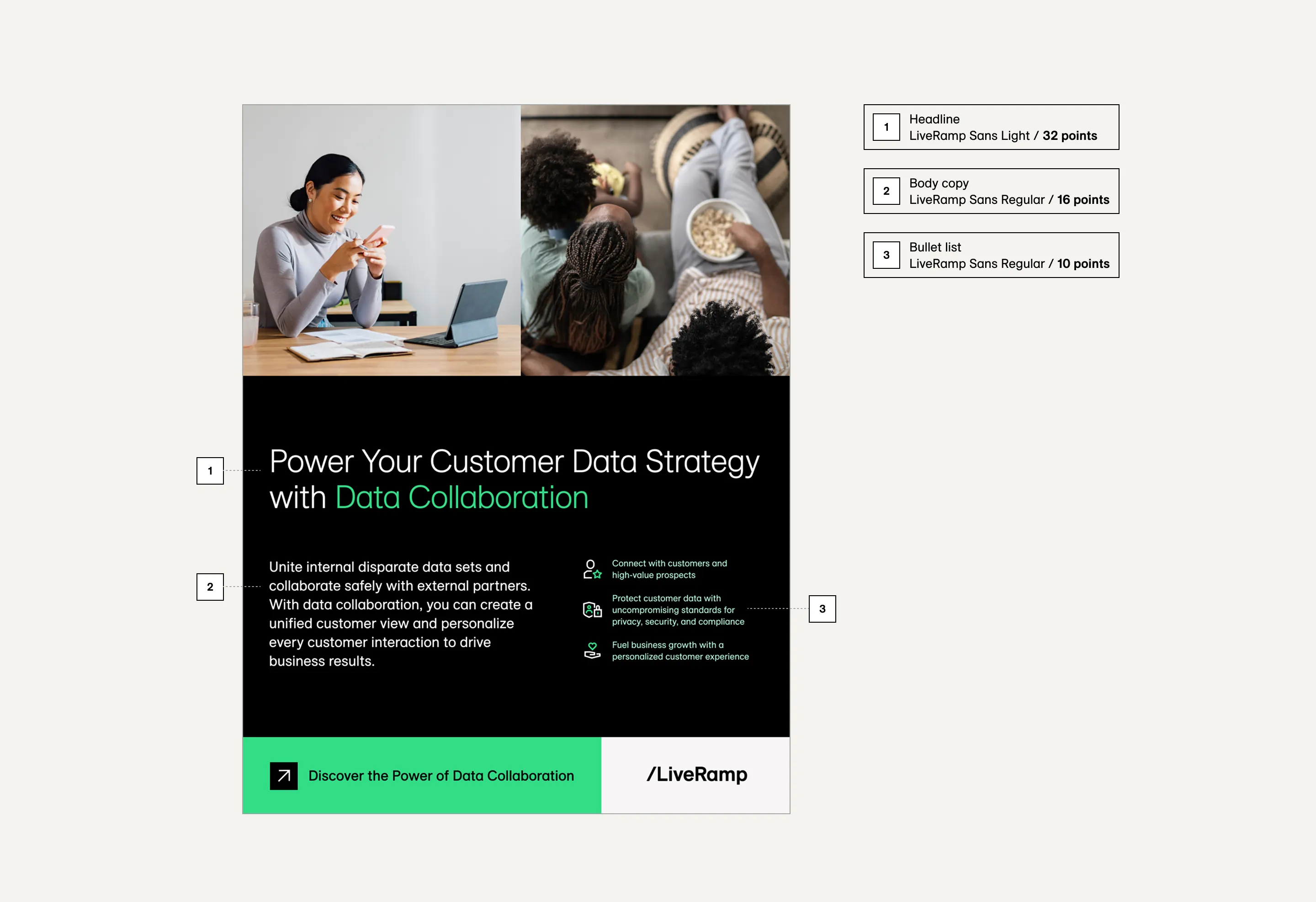
As a baseline when getting started, define the body copy – no smaller than 16 points – and then double the size for headings, in this example, 32 points. For larger headings, increase the scale to 3x.
Do not use text smaller than 16 points for body copy.

Letter Spacing
Letter spacing should not be adjusted for body copy, but you should make small (1 – 3%) adjustments to tighten heading text.


Headlines set above 24 points generally require letter spacing at -2%. Headlines set above 48 points generally require letter spacing at -3%.


Good letter spacing: -3%


No letter spacing applied leaves awkward gaps between letters
Line Length & Line Height
Ideally, text boxes should have a maximum width of 10–13 words, or 50–65 characters. This helps to keep longer bodies of text readable.
Headlines should have at least two words on each line, and generally up to four words as a maximum, depending on individual word length.
For line heights, use generous line spacing of 130–150% (1.3x – 1.5x) for optimum readability when setting body copy. For headlines, use 105 – 115% (1.05x – 1.15x).
Do this


Line length: Optimum headlines of ~65 characters


Optimum headlines of ~65 characters
Don't do this


This line length of this headline and text box are far too wide. Avoid long lines of text


Body copy line height = 150%.


Text line height of 110% is too tight, making content difficult to read
Hierarchy
Hierarchy refers to the visual structure of the layout and the relationship between the text elements.
The clearest way to establish hierarchy is by defining contrasts of scale, with headings being the largest text elements and body copy the smallest. We can emphasize certain words and phrases by setting them in a bolder font weight. Contrast in type style and scale are effective tools to lead the reader through a section of content in a specific order.
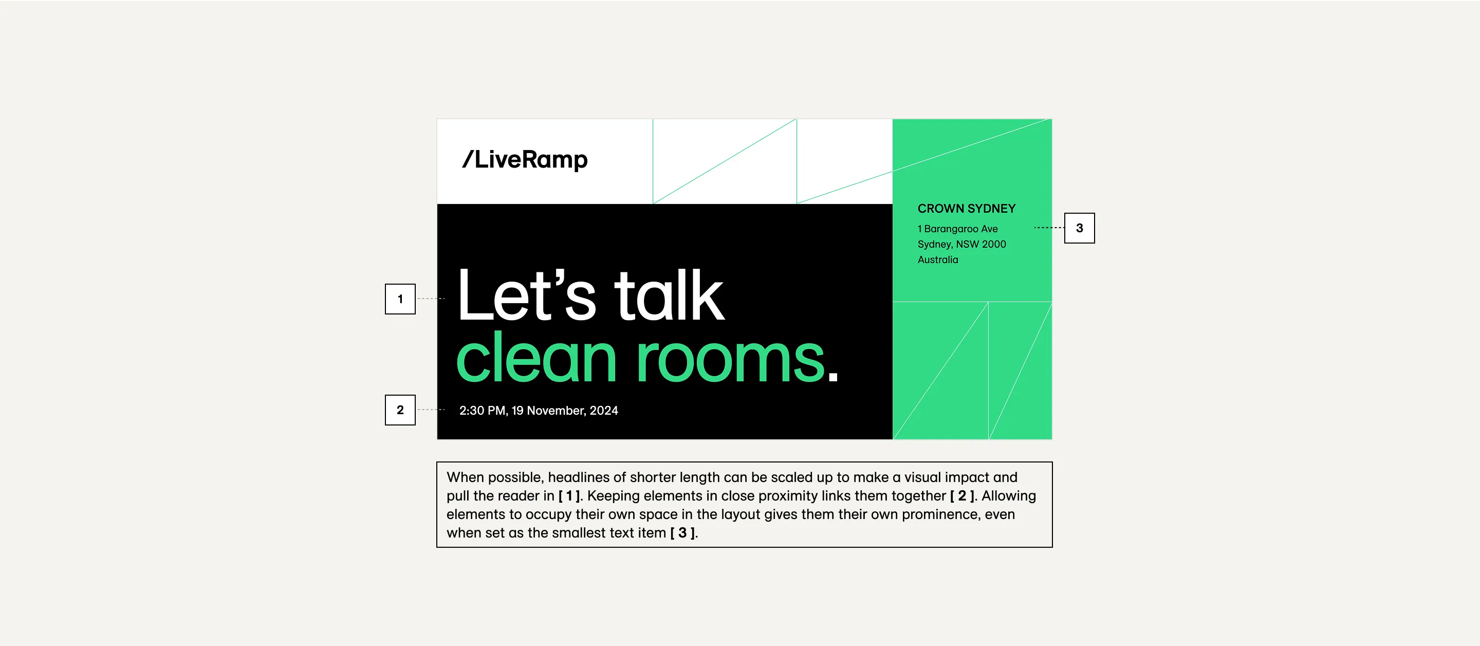

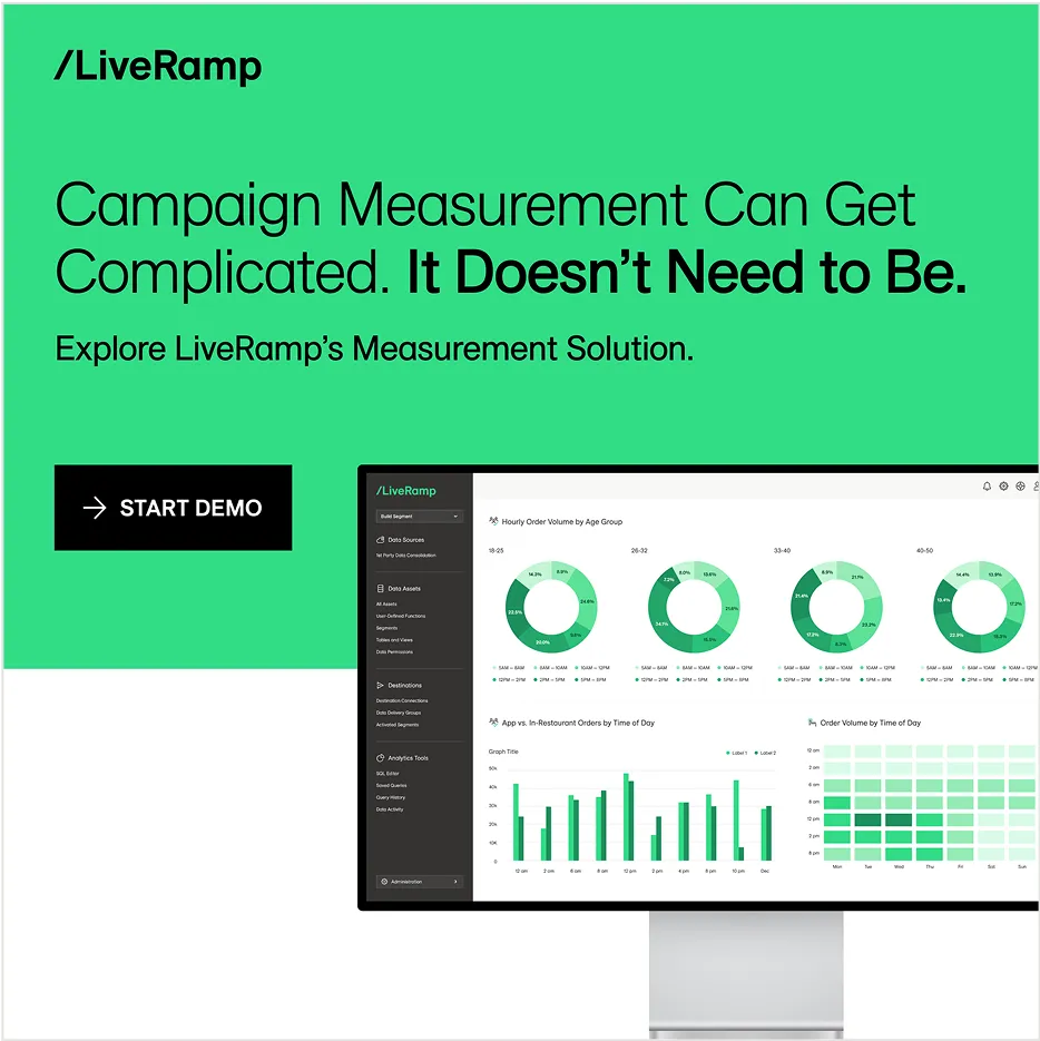

The examples above display contrasting scale to help define hierarchy. Emphasizing specific words or phrases by color or heavier font weight, balancing text, button, and image. Scaled up quote marks make a statement and help set context.
Accessible colors
To ensure all text is accessible to the reader, we need to be mindful of certain color combinations for both light and dark backgrounds. LiveRamp requires a text contrast of 4.5:1 as per the WCAG 2.0 level AA standard.
Do this


Contrast ratio: 21:1 – PASS


Contrast ratio: 11.61:1 – PASS


Contrast ratio: 11.61:1 – PASS


Contrast ratio: 11.61:1 – PASS
Don't do this


Contrast ratio: 1.8:1 – FAIL


Contrast ratio: 3.48:1 – FAIL


Contrast ratio: 2.26:1 – FAIL


Contrast ratio: 1.8:1 – FAIL


