Grid
The LiveRamp grid is the foundation upon which the brand identity system is built. It must be used across all branded applications—both digital and print.
The grid ties the elements of our identity together, and helps position our visual style as distinctive and unique. It provides flexibility while ensuring consistent placement of elements and information.
Structure
The LiveRamp grid starts with a simple, single line. It can be minimal or expressive, but every grid application follows the same basic underlying structure and principles. The grid is a direct response to the slash in the LiveRamp monogram and logo


The grid moves from left to right to maintain a link back to the logo

Grid lines never move from right to left, or ‘backwards’.
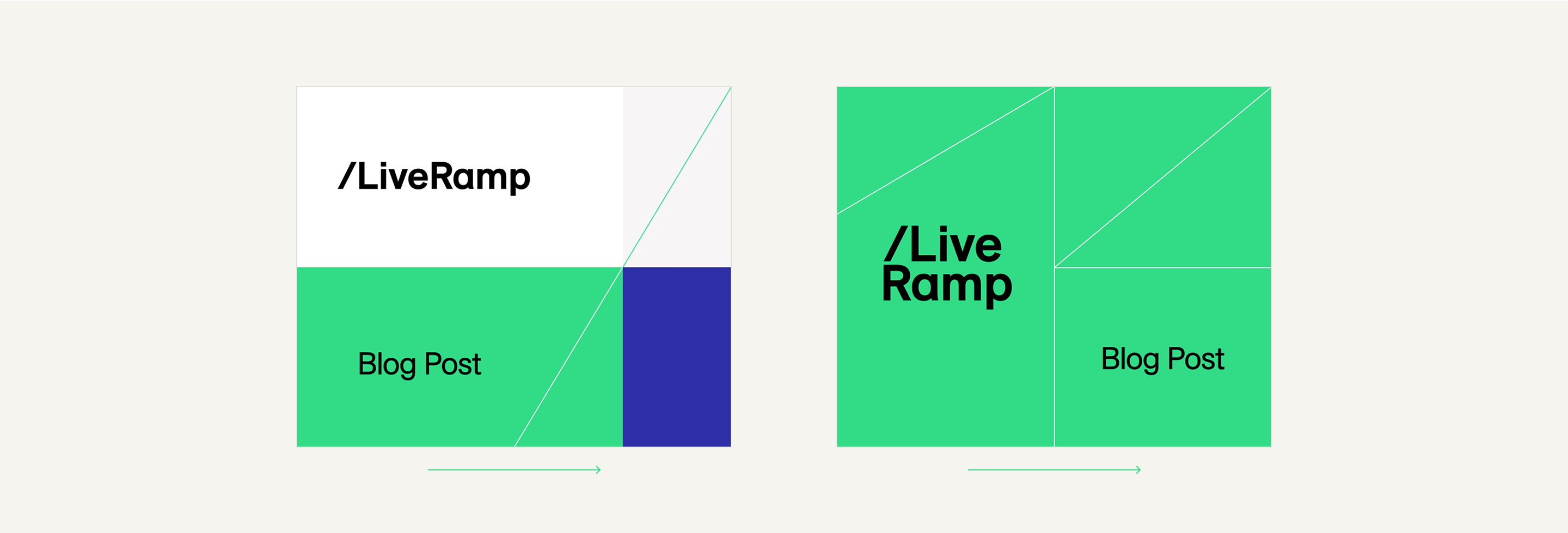

The grid can display as a single diagonal line

Grids can be created using diagonal and vertical lines

Grids can be created using diagonal, vertical, and horizontal lines

Diagonal and vertical lines move across color blocks to create a continuous experience

When creating grids, diagonal lines can be set at varying degrees—they do not have to always match the angle in the monogram or logo

Do not build grids without diagonal lines. They look rigid, static, and lack movement. Grids should feel fluid, dynamic, and on the move.


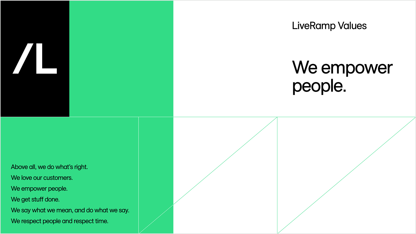
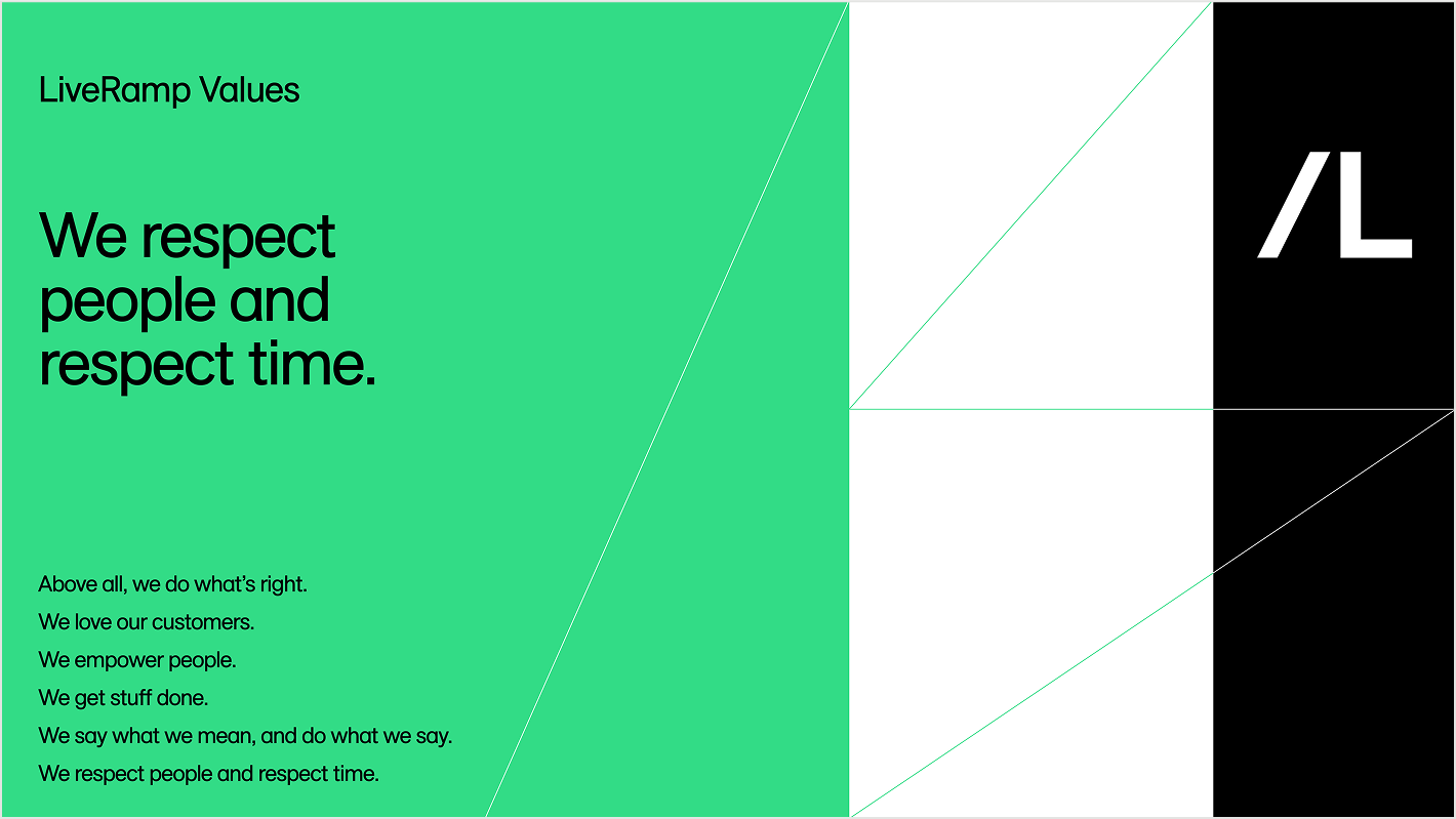
Grid proportions can be variable and flexible. While there is no formula for how space within the composition should be divided, the grid should be considered alongside other visual elements such as typography, image, and color to create a harmonious and impactful layout.

When titles or copy are part of the layout, grid lines should not overwhelm or dominate; they should support.
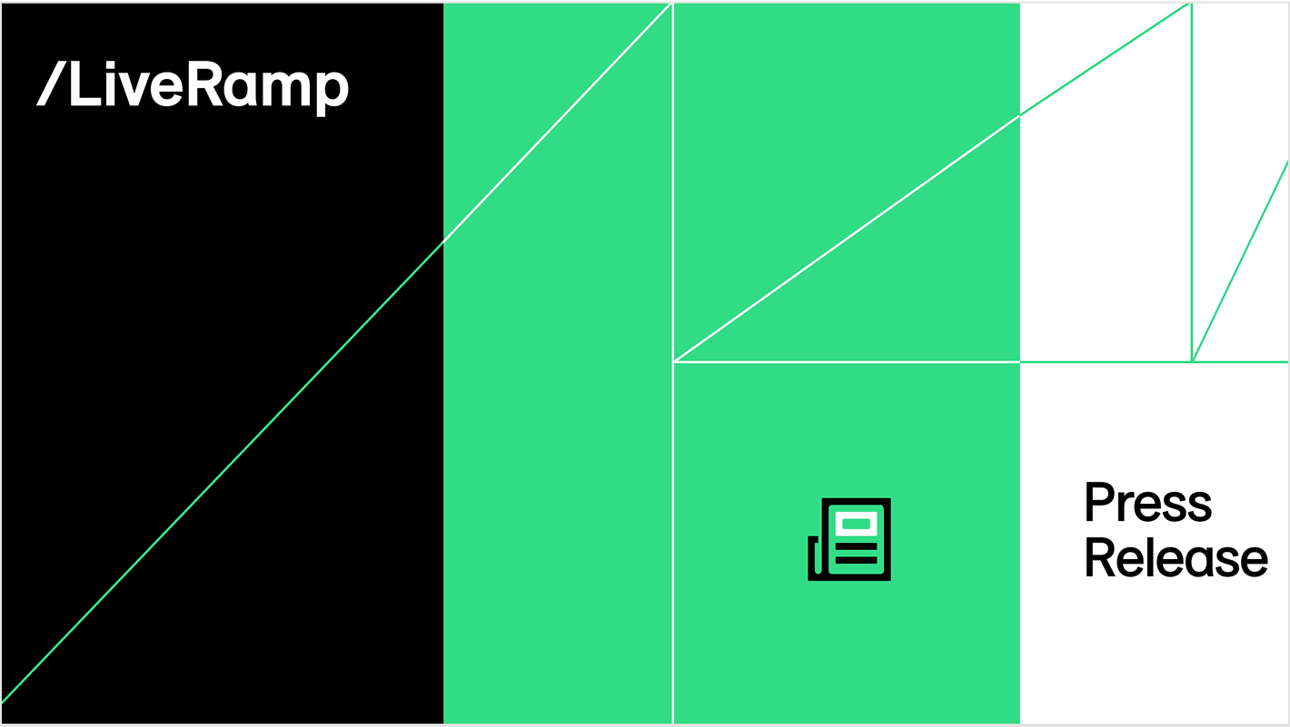

Grid lines can be more expressive if content is minimal, as in the Press Release social card above. Minimal grid lines can also add a brand flourish, as the Webinar social card above right demonstrates.
Color integration
The grid works best when it’s interacting with color. Passing through adjacent color blocks is a conceptual link to how LiveRamp enables data transformation and flexibility in it’s solutions.
Below are examples of color interaction, and a few watch outs to be mindful of.
Grid lines change color as they move through fields of different colors. For best results, do not use colors outside of the composition palette for the grid lines. Keep things cohesive and uniform. If in doubt, simplify.

Grid lines can be a single color throughout a composition – the two examples above show how grid lines can be subtle brand elements that support content rather than call attention to themselves.


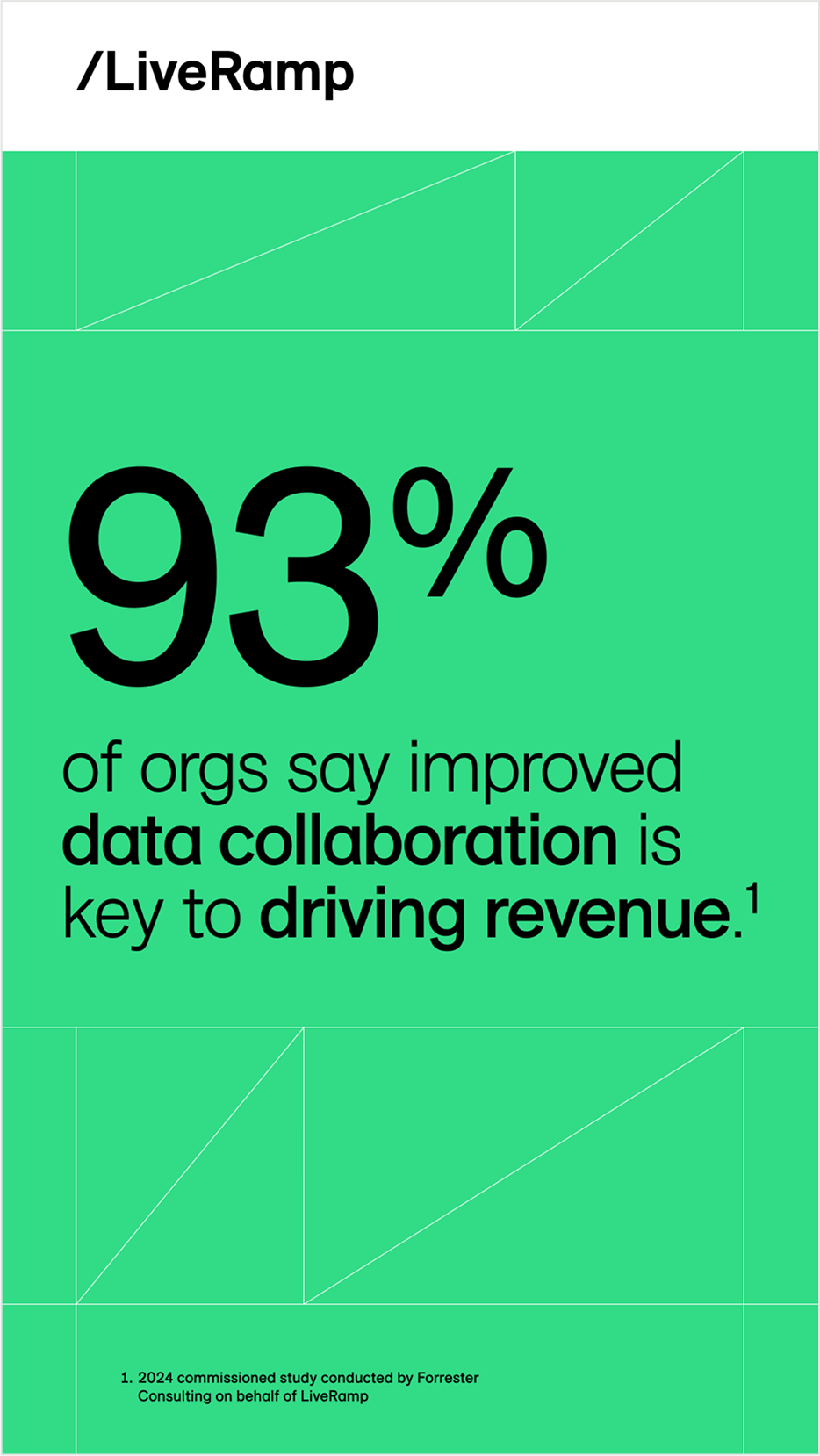
Grid lines can be used as an underlying texture (left example), or supportive structural elements (center and right examples)
Don't do this

Use colors that clash

Increase the stroke weight of the grid lines. 1 or 2px is ideal

Do not overuse the grid. Grid lines should be purposeful and help guide the eye or provide brand presence. Too many grid lines serve up a distracting and visually noisy experience