Icons

LiveRamp iconography uses a uniform
approach of construction to create symbols that are consistent and on-brand.
Color variations
Icons can be either one or two color – this is determined by the background color. Please see below for icon and background color combinations.
Do this


Black and green icon/white background

Black only icon/green background

White and green icon/black background
Don't do this

Green icons/white background

White icons/green background

White and black icons/green background

Do not use one and two color icons together
Minimum size

Minimum size is 16px

Where possible, preferred icon size is 32px
Icon use best practice
LiveRamp iconography uses a uniformsystem of construction to create icons that are consistent and on-brand.


Icons are often used to help define an intended action within a UI, such as the examples here (clockwise from left): Video play button, Download arrow or previous and next buttons, and a close dialog button.
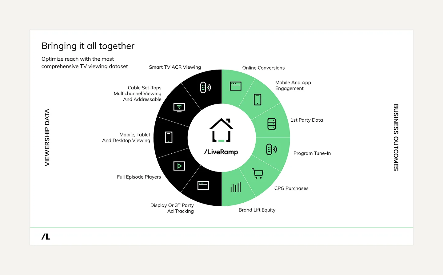
Icons are also used to good effect when creating diagrams or tabular content, and when dealing with concrete subject matter such as industries or technologies. This is best reserved for slide deck presentations.

Use photography, product illustration, and device mockups to communicate a concept or narrative

Don’t use icons to build illustrations