Product Illustrations

LiveRamp’s product illustration system is designed to serve as a narrative-driven view into the LiveRamp platform, using a suite of UI elements to visualize features and solutions.
Levels of abstraction
There are three different fidelities for product illustrations: hint, complete, and dashboard. Each is representative of a different degree of detail within the product.
Hint
The most abstract level of the product: text is mostly anonymized and converted to blocks, and the eye is drawn to specific UI elements or features. It should be leveraged when suggesting the presence of an ability or feature in the product, and at the highest level of storytelling, e.g. an ad set introducing the concept of LiveRamp’s analytics abilities to a new customer.


The feature being highlighted is the data visualization available within Live/Insights. Everything else is abstracted to suggest content.
Complete
The middle level of abstraction, a complete illustration is a whole, accurate representation of a modal or feature within the product. Best used in situations when the accompanying messaging refers a specific functionality of the LiveRamp product, e.g. discussing the features included in our Clean Room capabilities.

The entirety of the Question List feature is being highlighted as a full feature within LiveRamp Clean Rooms, and the illustration is accurate to the product experience.
Dashboard
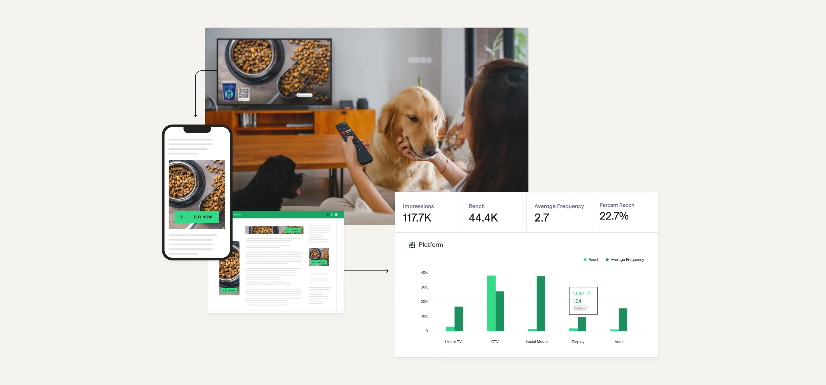
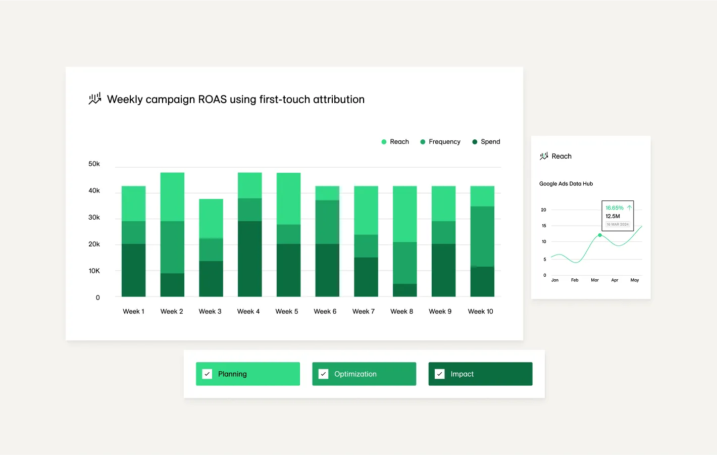
The highest fidelity illustration, a dashboard is an accurate representation of a full product screen. These should be used only when the value propositions being communicated are product robustness or full dashboard capabilities, e.g. the variety of different data visualizations offered by Live/Insights.

This example of a QSR (quick serve restaurant) Insights dashboard is robust and accurate to the product experience, and communicates the breadth of insights available to Live/Insights customers.
Color Schemes
There are two pre-set color schemes for product illustrations, which alternate use depending on background color.
Light (Default)
To be used on light or mid-tone backgrounds.
A white fill with dark grey (Warm Grey 06) lettering and a 1px light grey (Warm Grey 01) stroke. If the element is alone (not within a dashboard), Drop Shadow is required—select “Product Illustration Shadow” from the /L Brand Style Guide Library.

Dark
To be used on dark backgrounds only.
A dark grey fill (Warm Grey 06) with a dark grey stroke (Warm Grey 05) with light grey (Warm Grey 01) lettering. For the top level element, a drop shadow is required—select “Product Illustration Shadow” from the /L Brand Style Guide Library.

Don't do this

Don’t change colors or create new color schemes.

Don’t mix different color schemes in one vignette.
Collaging
The product illustration system is build to stand alone or to be collaged with other visual elements to create vignettes. These collages should tell a story about the connection between the LiveRamp product and the real world.
Do this
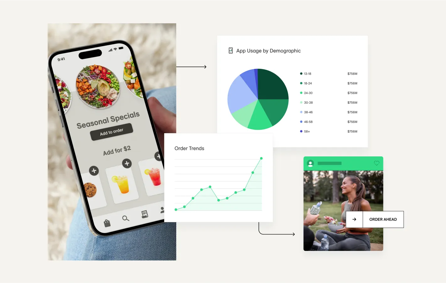
Tell stories about the LiveRamp product interacting with the real world.
Ensure product illustration elements are legible and clear.