Logo
The LiveRamp logo embodies simplicity and the magic of solving complex problems easily. Two simple characters—the slash and the “L”—together create a ramp that elevates the enterprise, accelerates growth, and creates a dynamic foundation for empowering customers.
Our logo is available in two configurations—preferred (horizontal) and alternate (stacked). Use the preferred configuration whenever possible. The alternate configuration should only be used when space limitations don’t allow use of the preferred logo.
Clear space & minimum size
The LiveRamp logo must be clear and legible wherever it appears. The minimum size is the smallest our logomay appear without compromising legibility. Please adhere to the following specifications when placing the LiveRamp logo.
Clear space is the area surrounding the entirelogo. It must be kept free of any visual elements,including text, graphics, borders, patterns,and other logos.
Clear space is measured in relation to “X,”which equals the width of the slash (“/”) in the logo.
The minimum size is the smallest our logo may appear without compromising legibility. Shown above are therecommended minimum sizes for both digitaland print applications. Consult Marketing for guidance and approvalshould an application of the logo requireit to be scaled smaller than minimum size.
Color variations
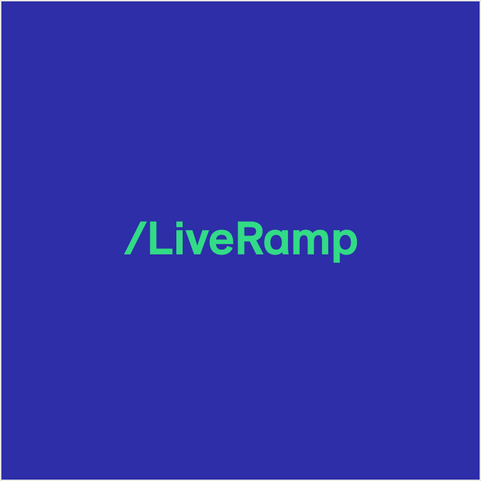
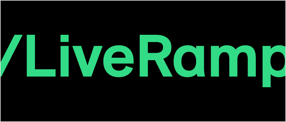
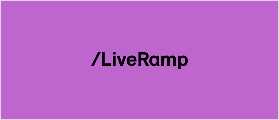
The LiveRamp logo is available in three color variations: positive/black, reverse/white and reverse/green. Shown here are the approved logo/background color pairings. Do not place our logo on any other colors, or on full-color photography.
Do this


Black logo/white background
Black logo/green background
White logo/black background
Green logo/black background
Don't do this
Green logo/white background
White logo/green background
Green logo/blue background
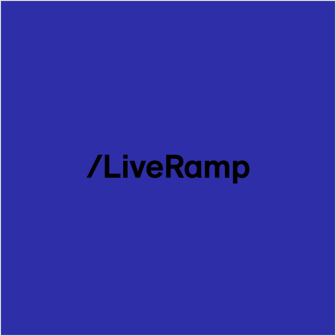
Black logo/blue background
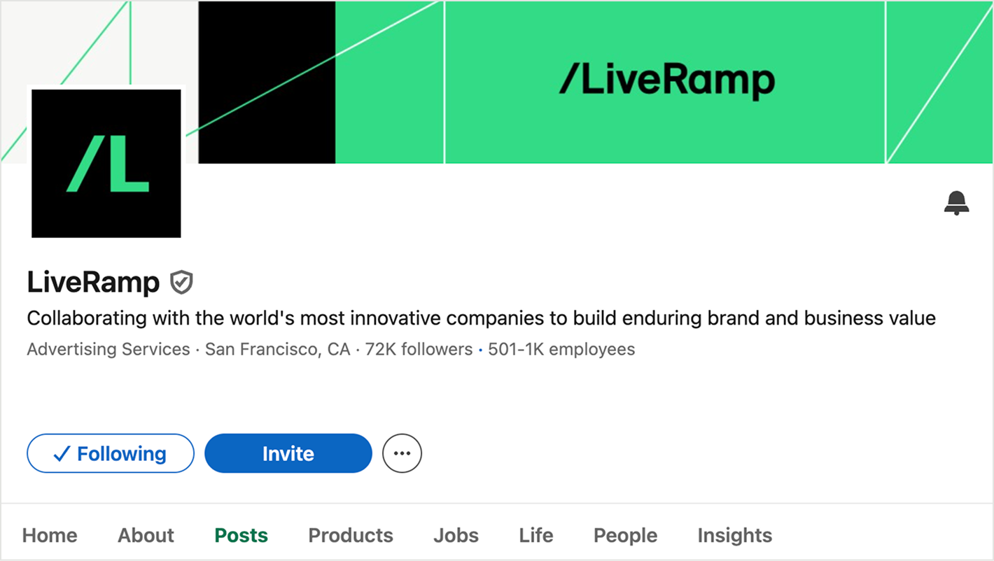
Co-branding
When placing the LiveRamp logo alongside partner branding, it’s important to give both logos ample white space. Please respect the following guidance when settings logos next to one another.


Incorrect usage
The LiveRamp Logo is custom drawn. Never modify or recreate it or its elements. Always use the logo artwork as provided. The examples below illustrate uses that should be avoided. These usage rules apply to all versions of the logo.
Don't do this
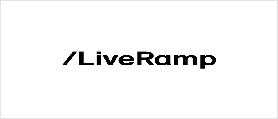
Do not scale the logo disproportionately

Do not alter the configuration of the logo
Do not change the color of the logo
Do not change the font of the logo

Do not add drop shadows to the logo
Do not stretch, skew, or distort the logo
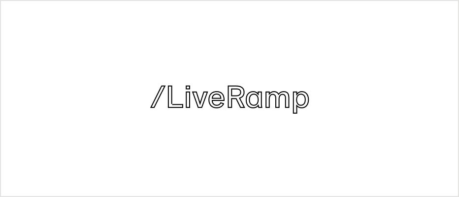
Do not outline the logo
Do not crop the logo
Do not rotate the logo
Do not place the logo on colors outside of our palette

Do not place the logo on imagery

Do not use the logo in running text
Monogram
The LiveRamp monogram is an elegant, dynamic distillation of our logo. It may be used large-scale as a super graphic, or small-scale as a jewel. The LiveRamp monogram should only appear withinthe context of the larger brand identity. It shouldnever be used in place of the full logo.

Monogram color variations
Our monogram is available in the same color variations as our logo, and the same background usage rules apply.


Monogram usage
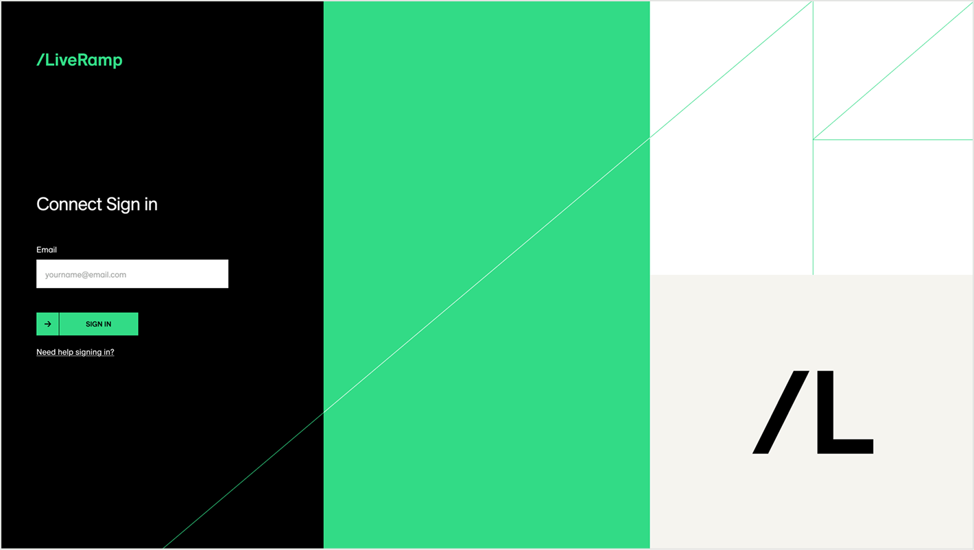
The LiveRamp monogram should never appear without our logo, whether on the same page in a single-page design, or on different pages in a multi-page design. The exception is app or social media contexts, where the monogram may appear with the company name in text.
In single-page applications, the monogram and logo should be far enough away from each other that they do not appear to create a lockup. On merchandise and apparel, the monogram and logo may be located on different sides of an item, such as on the front and back of a shirt.